The relationship between popular music packaging and illustration is longstanding. As with book jackets there was an early recognition that attractive visual imagery might help complement the content.
Illustration could interpret, delivering a subjective viewpoint that often eluded the camera.
As print technology developed, illustration’s relationship with music deepened. Images became allusive, mysterious and new formats offered wider vistas for visual expression.
But the concept of the artifact – a physical music product wrapped in a picture – is under pressure from new technologies. What was once print might now be light beamed through a touch screen.
How will illustration relate to popular music as the 21st century unfolds?
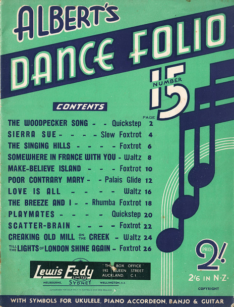
Albert’s Dance Folio No.15 (1939)
There was a time when music in the New Zealand home was, literally, a hands-on pursuit. Right up until the mid-1940s “parlour music” held sway and printed scores for piano accompaniment – hymns, light classical and popular song – accounted for a significant percentage of the music business’s output.
Some sheet music was produced locally but, more often than not, overseas content was repackaged and printed for domestic consumption, copyrighted and priced especially for the colonies.
The pictures and designs that graced sheet music covers tended to be literal; the general subject of the songs depicted via traditional figurative tropes. But in the absence of illustration, or photographic imagery, the commercial artist’s skill at hand-lettering would come to the fore.
Typographical designs such as the Albert’s Dance Folio above were common (Albert's is the well-known Australian family publishing firm: “home of the hits”, and of AC/DC). This style of cover was painstakingly achieved via pencil, brush and ruling pens: diabolical devices that would leak on a whim, scorning the steady hand and willfully splattering ink across the page.
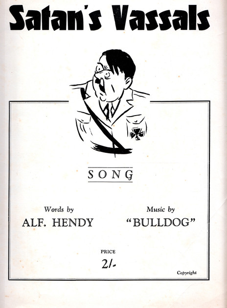
Satan’s Vassals (1940s)
A locally produced song sheet such as ‘Satan’s Vassals’ stands out as something an oddity. Clearly topical, it dispenses with the polite understatement of the parlour music era. Instead it offers crude polemic – a response to the desperate international situation – to be banged out on the piano to a martial beat: “With our honour still all tops/ We will teach those Nazi sots …” The cartoon Hitler is rendered as a dolt, a blustering buffoon on a piece of propaganda to stoke the homefires and stiffen the Kiwi spirit.
The angular, extra bold lineale font is called Fanfare, created by the German designer Louis Oppenheim in 1927. Famous for his posters decrying the perceived indignities imposed on the Weimar Republic by the Treaty of Versailles, Oppenheim, a Jew, never saw the might of the Republic restored. He died in 1936, age 57, three years after the Reichstag fire.
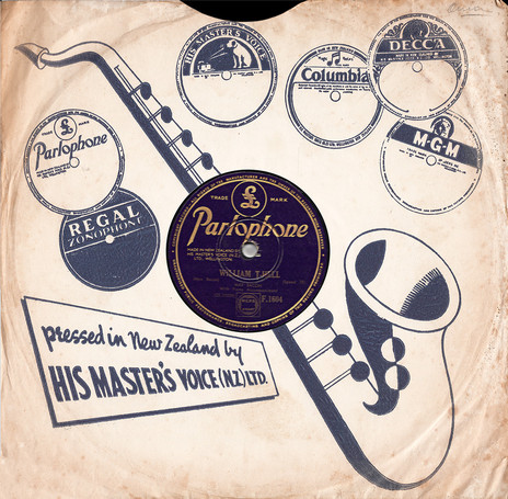
His Master’s Voice (NZ) Ltd record sleeve (early 1950s); Nimmos record sleeve (c. 1940s)
Prior to 1949 records sold in New Zealand were manufactured overseas. Some of these imported pressings came in sumptuous “albums” – bound collections of discs with colour artwork on their book-like covers and leaflets with information about the artists and songs.
More commonly though single 78rpm discs were housed in coarse, sugar paper sleeves and, after the surprising success of Pixie Williams’ homegrown hit ‘Blue Smoke’ (written by Ruru Karaitiana, released on Tanza), they started to feature artwork created especially for the local market.
The HMV cover above – proudly declaring that the company now manufactures its discs at home – uses illustration to promote its label roster. With a neat, jazz-age modernity, the sleeve is dissected by the stylised saxophone, the ellipse of its bell echoing the advertised labels as well as the disc’s actual label revealed in the die-cut.
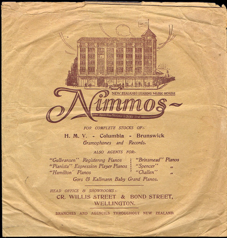
Retailers were savvy to the marketing potential of printed record sleeves. Up and down the country music stores and disc emporiums sought to promote their shops with elegant illustrations and eye-catching calligraphy as exemplified in the Nimmos bag. Favourite songs, enclosed inside proprietary sleeves, lingered long in the household; an effective device for keeping the store’s name forefront in the customers mind.
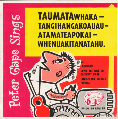
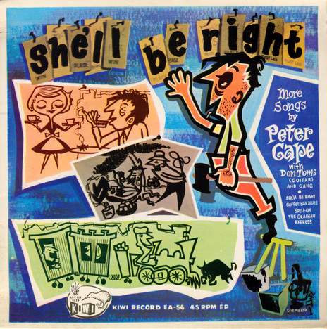
Taumatawhaka-tangihangakoauau-atamateapokai-whenuakitanatahu (1960); She’ll Be Right (1961)
Before his 28-year stint as cartoonist on the Dominion newspaper, Eric Heath scraped a living as a freelance illustrator and designer. His faux-cubist drawings graced a number of record sleeves for book publisher AH & AW Reed’s Kiwi label, the Peter Cape EPs above being probably his best known.
By the late 1950s and early ’60s this sort of mainstream modern style had fully infiltrated commercial art. It could be found in advertising, poster design, packaging and animated cartoons. Heath’s work from the early 1960s is identifiable by its distinctive, twirly lettering, similar to the jazz calligraphy of David Stone Martin in the US and the sardonic scratchings of Britain’s Ronald Searle. In a 2010 interview for the Dominion Post, Heath recalled his training at Milsom Studios, a Wellington advertising agency: “Drawing one word could take all morning, everything had to be so precise, it was a good grounding.”
Where the early sleeves for New Zealand produced 78s had been necessarily basic – due to production cost limitations – by the 1960s full-colour offset lithography was widely available. Even four-song 45rpm EPs such as the Peter Cape discs were given the deluxe treatment: eye-popping colours, liner notes and glossy lamination.
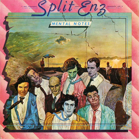
Mental Notes (1975, 1976)
With a song called ‘Titus’ – and a spoken passage on ‘Stranger Than Fiction’ lifted straight from the back of one of his Penguin books – Mervyn Peake’s shadow would seem to loom large over Split Enz’s 1975 debut LP.
Lyrically that might well be the case, but the lunatic vaudevillian aesthetic that the group struts here is a million miles away from Peake’s monochromatic grotesquery. Phil Judd’s cover painting is hotwired Dali, pumped full of jet-age dread and daubed with proto-punk pastels.
The scene depicted is nightmarish: a Cinemascope sunset about to be engulfed by a tidal wave of random allusions from stage right. The band looks like they’ve escaped from the “special bus”, with Tim Finn’s gurning singling him out as a real trouble causer.
It’s a surreal grab bag of anonymous imagery, entirely in line with the mid-1970s mood of post-hippie ennui. Judd’s most obvious antecedent for the cover would appear to be Mati Klarwein’s intricately morphed paintings used on Santana’s Abraxas and Miles Davis’ Bitches Brew. The baby on the back of Mental Notes gatefold also suggests the influence of Stanley Kubrick’s film 2001: A Space Odyssey – the child is the father of the man?
If pushed, I’d plump for the later, 1976 retooled version of the album as released in the UK. It’s the one I know and, though the original New Zealand edition is more restrained in its design, the UK release – with its luridly theatrical candy-stripes – caught something of the English punk zeitgeist, about to explode on London’s Kings Road.
The reproduction quality of Phil Judd’s painting across the many iterations of this album has been wildly inconsistent. Even on first pressings – that would appear to be from the same production batch – the colour cast can be completely different. Later pressings are sometimes blueish, sometimes reddish; it seems entirely random. It’s possible that the transparency used to create the initial colour printing plates was lost somewhere along the line and a copy was made from an already printed cover. The UK version of Mental Notes fixes the colour inconsistency. One presumes Chrysalis were furnished with a new, superior transparency of Judd’s altered painting?
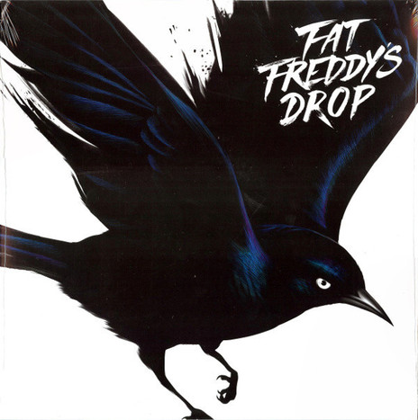
Blackbird (2013)
As the LP era gave way to the Liliputian dimensions of the digital age, approaches to music packaging changed. At first, designers looked to exploit the jewel-box and digipack format of CDs. Later they wrestled with the tiny pixels of the iPod and smart phone screens.
Against the odds though vinyl clung on. It got a bit streaky there for a while – the mid-90s peak of CD sales threatened to extinguish the 12” disc for good – but the record bins are, happily, full of LPs.
As far as artwork goes nothing comes close to the impact a square foot of cardboard can deliver. Fat Freddy’s Drop’s 2013 album Blackbird looked fine as a CD, but when I saw the 12” vinyl, displayed across Real Groovy’s Queen Street window, Gina Kiel’s avian phantasm really flew.
Fat Freddy’s Drop have embraced illustration. They’ve eschewed the easy option of sterile promo-shot photography so often seen in the record racks. Covers like Dr Boondigga (2009) utilised lovingly rendered comic art and many of their singles and EPs come packaged in offbeat graphics that combine drawing, painting and digital design.
Obviously they’re wise to the fact. Music and pictures, it’s a perfect combo.
--
Sound and Vision: Album Design 1
Sound and Vision: Album Design 2
Sound and Vision: Album Design 3
Sound and Vision: Album Design 4
--
Chris Mousdale is a native of Liverpool, England, living in New Zealand since 1990 where he works as an illustrator, designer and artist. He’s taught Illustration and design at Auckland University of Technology and has held numerous solo exhibitions of his paintings and constructions. In 2003 he won the New Zealand Post Children’s Book Award for Brodie with Joy Cowley. Always active in the music/art industry, Chris served as curator for exhibitions of Brazilian bossa nova LP designs (2000) and co-curated the British Council Sound Design exhibition of New Zealand record covers (2002). His recent design work includes a series of covers for Blue Note Records in association with Music Matters Ltd. This article is the fifth of a series for AudioCulture.