The grooves of a record might be where you find the show business, but the label is where you find the business. In days gone by, company, artist, songwriting credits and publisher were spelled out in eccentric typefaces and candy-coloured inks. A feast for the eyes, as well as the ears.
There’s definitely something of the lolly shop in a collection of record labels. Marshmallow pinks and sherbet yellows, gobstopper reds and caramel browns – Polyvinyl Chloride Liquorice Allsort? Yup, don’t mind if I do.
Action! (1966)
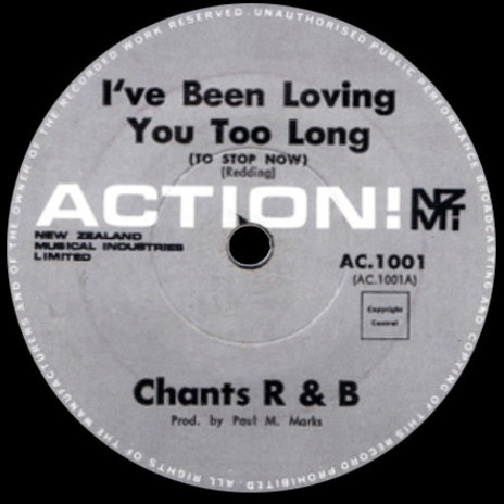
Featuring teutonically precise rim text, evocative of the beautiful typesetting typical of German record packaging in the 1950s and 60s, Action! is a modishly austere label design.
Black, white and concrete grey denotes maximum R&B; white-boy blues spat out by snotty-nosed malcontents loitering on the fringes of the beat boom.
This is stomping music and the “New Zealand Music Industries Limited” moniker adds a shot of Ian Fleming-era sub-military menace (with a knowing nod to EMI – “Electrical and Musical Industries”).
The label’s curt exclamation point precludes conventional civility – fuck art, let’s dance – and is delivered in the cool, extended modernity of Eurostile, a 1962 font designed by Aldo Novarese, as a refinement on Microgramma, a sans-serif face he had helped develop a decade earlier.
Soundex (1960)
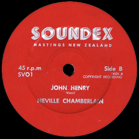
The Soundex label design must have been regarded as something of a throwback even in 1960 when it was first released. It conjures up “Empire” and a spartan, stiff-upper-lipped gentility associated with an older, pre-war generation.
The shadow font is called Neon, cut in 1936 and classified as a lineale tilting. It’s a perfect piece of Art Deco and one can easily imagine Bertie Wooster cooing over something similar on his wind-up gramophone as Jeeves hands over a “tissue restoring” cocktail.
And no, it isn’t that Neville Chamberlain.
HMV (1970 - 1973)
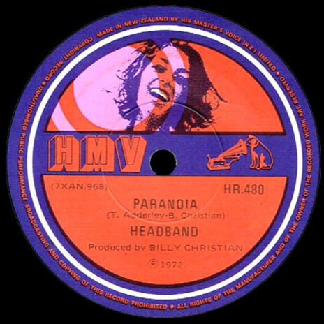
Resplendent in a late 60s palette of purple, pink and Jaffa orange – though actually used from 1970-1973 – this version of the HMV New Zealand label is classic mainstream hippie. Look at her teeth – she may be tripping but that doesn’t mean she’s a dirty dropout. No, man, that’s the Colgate-dazzle of a nice girl getting her head turned by the radiating good vibes.
Even little Nipper is getting high, reversed out from the purple haze as he stares into the cosmos down the horn of his orange zonophone.
Milton Glaser, the designer whose 1964 bi-dimensional Babyfat font features here, was surprised at its ultimate assimilation: “It started out as a rather esoteric letterform,” he recalled, “and ended up being used in supermarkets for ‘SALE’ signs.”
A perfect typeface then for this particular label iteration; sugar-sweet grooviness dosed with just the tiniest tinge of acid.
Young World (1966)
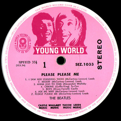
It was a shock when I first came across one of these in the wild. I’d been collecting records since the 70s but – in those pre-internet days – had never heard of this World Record Club sub-label. On first sight it seemed so incongruous. What were these puppyish teens, cast in lipstick and bubblegum pink (and more than likely conceived by the same in-house commercial artist as the HMV label above) doing inside the steel and glass modernity of The Beatles’ brisk LP debut?
It turns out that Young World was a short-lived project from WRC NZ contrived to palm off a slew of catalogue items the company deemed especially teen-worthy. In amongst the dreck was Please Please Me.
This unusual issue, released in 1965, was the first time the stereo mix of the album had been commercially available in New Zealand. The original 1963 local pressing, adorned with a handsome black and silver Parlophone label, had been cut in mono from Abbey Road tapes flown out to Wellington. For the subsequent, post-Beatlemania albums, New Zealand was blessed with top quality metal “mother” stampers, manufactured at EMI’s Hayes, Middlesex headquarters then sent down under to be pressed on the sturdy manual EMI presses located in HMV’s Wakefield Street plant.
Hens-teeth rare, these Young World Beatles pressings nowadays sell for many hundreds of dollars, this stereo variation being the most coveted. Unfortunately WRC’s budget ethos – three discs for ten shillings – meant a lot of these records were doomed to be thrashed and trashed on groove-grinding teenage bedroom gramophones. Aah, the follies of youth.
Sailor Boy (1961), Master #1 (1968), Master #2 (1973), Music World (1976)
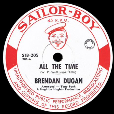
Pictured in the 1980s with his Burt Reynolds ‘tache and tycoon spiel, Hoghton “The Hustler” Hughes looked every inch the old-school record man. He first started out in the 60s with the Sailor-Boy label. Delightfully recherché and as camp as a row of tents, Sailor-Boy seemed to have caused some raised eyebrows amongst provincial retailers. So the boy went overboard and in 1968 Hoghton whipped-up the Master imprint.
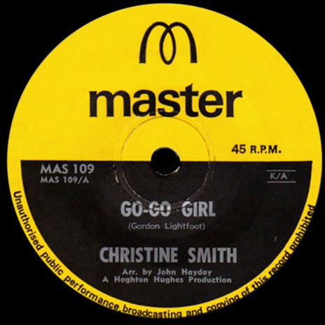
Now, I’m guessing that back in the day a certain famously litigious fast-food chain with their trademark gilded spans were just too busy to worry about a tiny record label in New Zealand. But c’mon, look at it. Is this first Master label design not just a little – ahem – “similar” to the branding of said ubiquitous beef-patty vendor?
What’s weird is that whoever designed the yellow/black Master label almost 50 years ago, appears to have predicted the current ubiquitous-beef-patty-vendor’s marketing campaign! Compare that letter M and the way it sits atop a lower case sans-serif. Am I wrong?
But maybe back then somebody did cotton on, because Hughes’ label dropped the banana-milkshake yellow and arching M and went with a rococo, somewhat cheesy revamp, possibly more suited to its catalogue of homegrown, somewhat cheesy country and western artists.
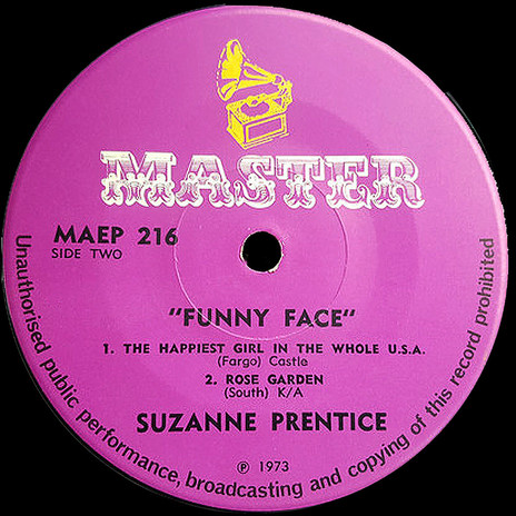
Anyway, by this stage Hughes was moving on to bigger things, dreaming up Music World, a down under operation that would eventually shift wagon loads of Z-grade cover-version LPs through gas station retail outlets and annoyingly persistent TV-driven advertising campaigns.
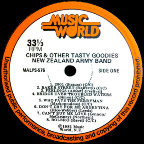
I doubt “The Hustler” mourns his deep-sixed maritime matey. The Hughes Leisure Group – and his company Bardon Ltd – are multi-million dollar business concerns. Those cheapo LPs and cassettes sure were good to him.
Tartar (1970)
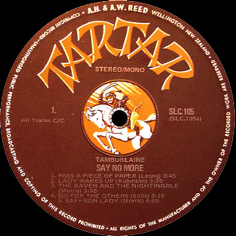
Plumb centre on this terrific label rides a Mongolian horseman on thundering hooves, intent on a bit of sword-swinging mayhem. It’s unfortunate that this particular spelling of Tartar seems now more commonly applied to the gunk that grows on poorly attended teeth or – conversely/additionally – the gunk they squirt onto your fillet o’ fish. But nevertheless, it’s still a stonking design.
Quite why AH & AW Reed would have chosen a 12th century Turko-Mongol tribal federation to head one of their sub-labels is a mystery. My guess – and I’m stabbing my Tartar sword wildly into the dark here – is that the early 70s popularity of the UK Trojan label, storming the international charts with their pop-reggae hits, caught someone’s eye. Certainly, the similarity between the dynamic illustration on the Tartar discs and the sword-wielding warrior depicted on the sleeves of the original Trojan 45s is striking, but, like I say, I’m only guessing.
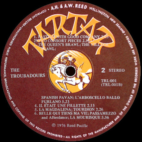
Annoyingly, whoever designed the Tartar labels hadn’t factored in the possibility of long-winded artist and song-title credits. On Tamburlaine’s 1972 album of folk-rock delights, Say No More, the label accommodates the titles and credits with ease. But by 1976 Reed’s typesetters had dropped the extended, sans-serif face they’d been using, for a beefier, old-style Roman font. As you can see above there’s an unseemly clash as the fancy-pants French and Spanish titles of The Troubadours album wrestle with the expansive, Turko-Mongol slashing strokes of the label name. The Tartar wins.
(I can hear them now, those long-ago Wellington label printers as they grumble over their smoko cup of Bell – “Tut-tut, them bloody designers!”)
CINDY (1965)
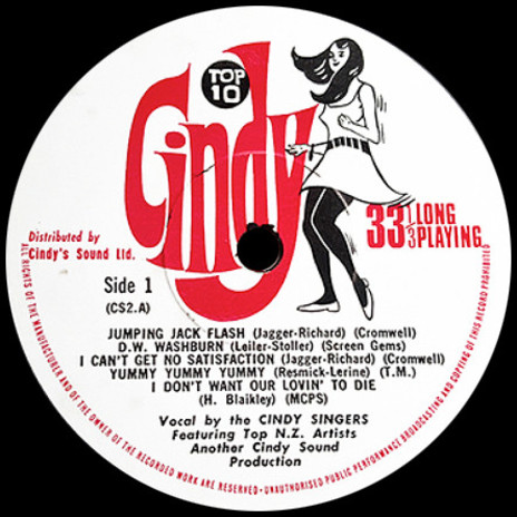
The Cindy LPs were budget compilations of 60s sound-alike chart hits. It was a common record industry move – wrangle a bunch of session musicians into a studio to bash out some radiogram fodder. The labels reasoned that kids wouldn’t care too much about quality. Besides, the LPs were cheap, leaving the youngsters more pocket money for their Jackie magazines and hula hoops.
I see Cindy as part of an unholy trinity of bargain-basement New Zealand Pop Art icons, sharing, as she does, a rough-hewn playground aesthetic with the taciturn cowboy of Big Ben pie fame and the giddy “Longest Drink In Town” milkshake giraffe.
RTC (1976)
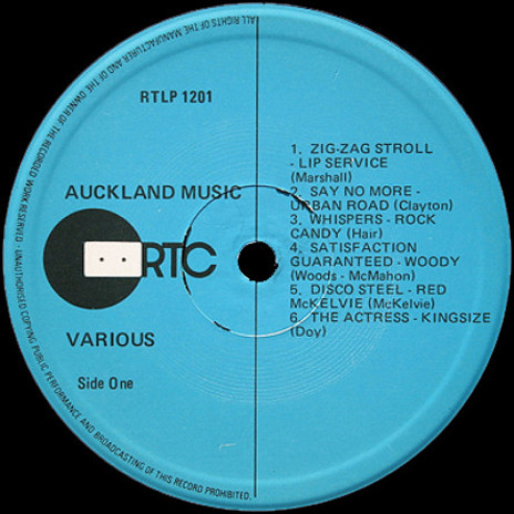
RTC was the local licensing channel for Virgin, Rough Trade and Beggars Banquet product from the UK. Through the late 70s and into the 80s, it packaged its fair share of post-punk spikiness as well as homegrown inventory such as this boisterous compilation.
As a label and logo design it hardly seems to have dated at all. The early 80s were a time when disaffection, alienation and bleak introspection were positive commercial selling points. RTC’s asymmetrically integrated compact cassette/vinyl disc logo is a suitably unsentimental graphic evocation.
So, on the surface this would appear to be a bracing example of functional design. But I warn you – once you see the unintended kawaii ninja face with its two unblinking eyes, you’ll never look at it the same way again.
--
Sound and Vision: Album Design 1
Sound and Vision: Album Design 2
Sound and Vision: Album Design 3
Sound and Vision: Album Design 5
Sound and Vision: Album Design 6
Sound and Vision 7, part 1: HMV graphics, late 1950s
Chris Mousdale is a native of Liverpool, England, living in New Zealand since 1990 where he works as an illustrator, designer and artist. He’s taught Illustration and design at Auckland University of Technology and has held numerous solo exhibitions of his paintings and constructions. In 2003 he won the New Zealand Post Children’s Book Award for Brodie with Joy Cowley. Always active in the music/art industry, Chris served as curator for exhibitions of Brazilian bossa nova LP designs (2000) and co-curated the British Council Sound Design exhibition of New Zealand record covers (2002). His recent design work includes a series of covers for Blue Note Records in association with Music Matters Ltd. This article is the fourth of a series for AudioCulture.