In 2002, along with Nick Bollinger and Katy Yiakmis, I worked on an exhibition called Sound Design. In it we attempted to gather together a selection of New Zealand LPs, EPs, 45 rpm singles and CD covers we hoped would trigger some sort of associative resonance with audiences in a live gallery context. The show toured the country along with a British Council exhibition of UK record covers.
Such an exhibition could never present a definitive account of music graphics in New Zealand and we were conscious that coherence is often fostered in brevity. Sound Design was collation based, not on aesthetic notions of good or bad or best and worst but more reflectively on the way that certain artifacts, when placed within an exhibition context, can resonate, dissonate or simply talk to each other in often surprisingly cogent ways.
The AudioCulture site, as a curated repository of similar digital artifacts, does this, I think, successfully. During my forays here I’ve discovered some fascinating conflations of theme and content, style and form, genre and zeitgeist, from across a wide spectrum of New Zealand music.
It’s in this spirit then that I’d like to present a belated Sound Design remaster, a compact outtake collection of New Zealand LP covers chosen by that unapologetically subjective crate-diggers method of rifling and plucking.
The Dedikation (1969)
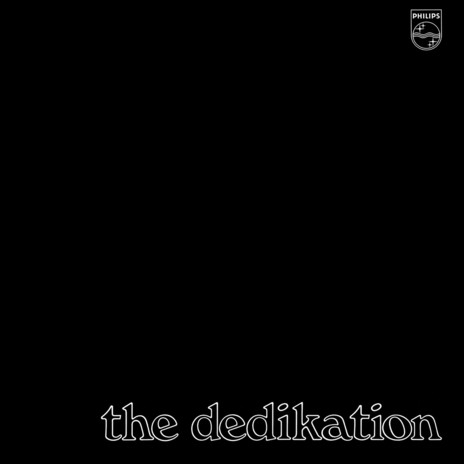
The Dedikation – The Dedikation, 1969. Designer not credited.
The 1984 mockumentary This Is Spinal Tap – which so effectively skewered the oft-ludicrous world of heavy rock – has become, like cat hairs in a carpet, irretrievably embedded into music culture. Knobs that go to 11, “Dobly”, exploding drummers, and “None more black”, I find it hard now to look at anything that is excessively black and to not hear those hilarious, idiot ramblings of Nigel Tufnel in my head.
How black is this album from The Dedikation? Well, from all appearances it would seem to be pretty darn black, and pretty great looking too. If you’re going to go down this design road – “Look Ma, no picture” – then it helps to be working with a display font that can hold its own. Stephenson Blake’s Windsor was first struck in 1905. It’s an eccentric specimen with beak-like serifs and short descenders.
The lower case outline variation on “the dedikation” is kerned as tight as a pair of black-velvet pants and parades its reclining strokes and tipped counters with a louche suavity. Alongside it in the record racks of 1969 could be found The Fourmyula’s Creation LP, similarly inscribed with lower-case Windsor bringing a touch of grace to an uncomfortably naff hairy-rock-combo-in-the-nude cover shot.
1969 was something of a “none more black” year for covers with Pye releasing the double album The Kinks in a black sleeve with gold lettering (mimicking the masthead of The Times newspaper) and Decca issuing the first LP from Genesis, From Genesis To Revelation, utilising a similar, purely typographical, black/gold combination.
The Dedikation LP however still manages to stand out. The relationship between the Byrds/Beatles/Cyrkle-esque band name and wonderfully elegant Philips logo suggests a seductive clash of order and chaos, light and dark, possibly not matched by the musical content, which judging from the track list, is mostly covers of then-current, Anglo-American pop hits.
The Guitars Of Graeme Bartlett (1963)
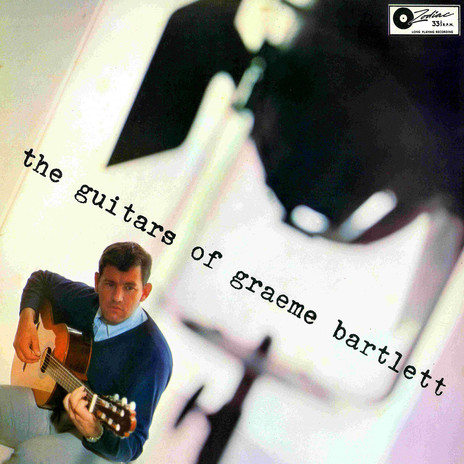
The Guitars Of Graeme Bartlett, 1963. Designer not credited.
The square format can be difficult to work with. You can grid it, segment it or focus on the symmetrical possibilities, but it’s often still a bugger to lay out. Moving things off the vertical/lateral axis is an effective way to reveal some less obvious spaces in the frame and, like a cinematographer’s “dutch tilt”, an off-axis view introduces tension, shifts the compositional dynamics, and entices the eye to travel a less familiar path.
The excellent cover above was a new one to me and as I look at it now the essence of the design would seem to rest wholly within the photograph. Once the decision was made to shoot (or crop) at a 60 degree angle I’m guessing the title/artist placement would have been self-evident.
The lower-case typewriter font connotes a stripped-back, no-nonsense informality, reinforcing the photographer’s nuts-and-bolts approach when they pull the camera back beyond the lights for a classic, early-60s vérité vibe.
Mr Bartlett’s collegiate ensemble of soothing grey, navy and sky blue is pure 2016 normcore, something one might encounter in a lookbook from the currently fashionable non-fashion brand Scotch and Soda.
Mr Lee Grant – Lee Grant (1967)
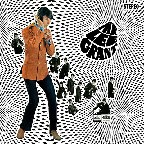
Mr Lee Grant – Lee Grant, 1967. Cover design by Peter Burge, photography by Sal Criscillo.
The Mr Lee Grant LP must, I suppose, present as one of the most iconic New Zealand record covers. Undeniably Beatles derived – combining a version of Charles Front’s amorphous lettering from December 1965’s Rubber Soul with the collaged monochromatic photography seen on August 1966’s Revolver – it’s also undeniably groovy and evocative in the way only true swinging 60s artifacts can be.
Sal Criscillo, the Wellington photographer who shot Mr Lee for the cover, has him throwing all sorts of shapes – “Show us your cufflinks, Bog …” – and his subject gamely obliges. The amazing hair was more than likely set in place with that chemical wonder Dippity-doo, a product famous for being Roger Daltrey’s barnet treatment of choice circa 1967.
Ebony – Ebony (1972)
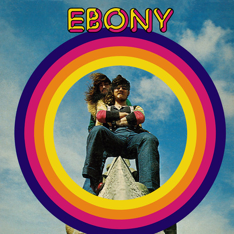
Ebony – Ebony, 1972. Designer unknown.
If Mr Lee Grant epitomises the camp dapperness of the 1960s, Ebony’s self-titled LP can, I think, stake a claim as an endearing evocation of the subsequent decade, redolent as it is of dungarees, foul-smelling sheepskin coats and hair, “flow it, show it, HAIR!”
Encircled in a Sesame Street-bright rainbow band, the ‘Big Norm’ boys perch perilously – and potentially painfully – on some sort of medieval pediment. Doing the typographical honours up top and centre is Pluto Outline from the font-house Face Photosetting. Pluto – a variation on that 1970s stalwart Frankfurter –features on a number of ’70s record covers, but might be most familiar as the typeface used for Bob Marley and the Wailers’ 1978 live LP Babylon By Bus.
With its primary-school palette and novelty font, some might see the Ebony cover as nothing more than lurid, processed ’70s cheese, but graphic design is a child of its time and the zeitgeist in 1972 was rich in the “fun” aesthetic. Tommy Roberts’ London clothing boutique Mr Freedom came bowling out of the back-end of the ’60s peddling over-inflated rock and roll juvenilia which, when filtered through knock-off classifieds in the back-pages of NME, Melody Maker and other music publications, became an internationally viable pop fashion.
At the arty end of the spectrum lounged Roxy Music – greasily ironic inside the gatefold of their first LP – and David Bowie on Pinups, but this “fun” style, already a distortion, would grow to grotesque proportions adorning tooth-rotting commercial confections such as The Bay City Rollers and Abba.
Ebony is a breezy, blue-sky slice of Kiwi design that, to my eyes, has survived the so-called “decade-that-taste-forgot” without embarrassing itself.
Highway – Highway (1971)
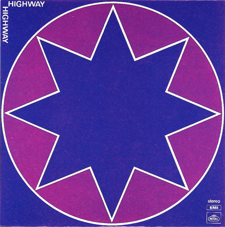
Highway – Highway, 1971. Designed by Marlene and Alan.
This one’s a redux. It originally featured in the 2002 Sound Design exhibition but over the years I’ve come to think that if I were to indulge in the conceit of a Top 10 or Best Of, Highway would be right up there.
Credited to “Marlene and Alan” (I’m presuming ‘Alan’ is Alan Galbraith from HMV) it’s a simple yet effortlessly timeless cover, the graphic design equivalent of one of those 100 year-old photos that appear on the internet apparently showing a time traveller from the future talking on a cell phone in 1926.
I could slot it into 1978, the height of UK new wave, and it would stand out, even alongside the acknowledged graphic mastery of Barney Bubbles and Malcolm Garret. The 1980s: post-modernism, Memphis design, the early days of computer graphics and Marlene and Alan’s star is brighter than ever. Second Summer of Love: the 80s into 90s acid-house boom and the Highway cover bunged onto a rave flyer would surely blow the minds of a field full of weekend trippers. In fact try it yourself: think of a genre, drop in Highway and see how it fares.
Doesn’t this somehow suggest the design is “empty”? I’d say no, arguing instead that the cover, in its actual guise – as a visual signifier for an early 70s New Zealand rock band – presents itself as something intrinsically mysterious, possibly outside of direct, explicit readings and only making sense when the performance pact between band and audience was consummated in the live setting or, less viscerally, in the commercial transaction of its purchase across a record shop counter.
(Accounts suggesting Highway was found in the sale-bins not long after release could be interpreted as a signal that the relationship between the music on the disc and the image on the cover was out of sync, but, more probably, it may merely indicate the appetite for this band’s particular brew was limited.)
Highway’s success, on a purely graphic level though, stems from its entirely whimsy-free design. Even the hardest, heaviest bands in 1971 were prone to Tolkienesque frippery and frilly, post-hippie taste lapses, but this cover is razor sharp. With stark simplicity it somehow manages to hint at an era’s glam-magick obsessions, post-pop art decadence, cosmic cock-rockery, and the mundane gigging realities of petrol station livery (Caltex?).
Of course, I may be over-egging the intent of this – fairly obscure – design. The star was, and still is, a common graphic motif. Pop artist and Sgt Pepper’s designer Peter Blake rendered a fetching pentagram for Pentangle’s 1968 Sweet Child LP, and in 2015 Jonathan Barnbrook set a five-pointed stellar trajectory for Bowie’s poignant last blast off on Blackstar.
With Highway it’s entirely possible that one dark and windy Wellington night Marlene and Alan simply got out the ruler and compass, drew a regular octogram, rubbed down the Letraset Frankfurter Medium typeface, then made a note for the printers to run the colours of the final cover at 100% Cyan and 100% Magenta.
Would such prosaic origins make any difference to how I feel about the design? No, I don’t think they would. Something this simple – this good – will always have the power to inspire a kind of wonder.
[Footnote: Alan Galbraith confirms that he is indeed the Alan credited on Highway, though says he was mainly responsible for the back cover. The front is the work of his co-designer Marlene, “an artist living in Paekakariki", though the design was "mostly the band's choice and they were very intuitive about this kind of thing.”]
--
Read Sound and Vision: Album Design 2 - here
--
Chris Mousdale is a native of Liverpool, England, living in New Zealand since 1990 where he works as an illustrator, designer and artist. He’s taught Illustration and design at Auckland University of Technology and has held numerous solo exhibitions of his paintings and constructions. In 2003 he won the New Zealand Post Children’s Book Award for Brodie with Joy Cowley. Always active in the music/art industry, Chris served as curator for exhibitions of Brazilian bossa nova LP designs (2000) and co-curated the British Council Sound Design exhibition of New Zealand record covers (2002). His recent design work includes a series of covers for Blue Note Records in association with Music Matters Ltd. This article is the first of a series for AudioCulture.