Isa-Lei: The Music of Fiji – various artists, 1959-61
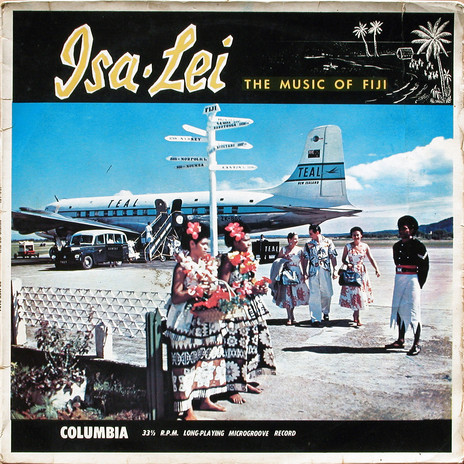
Isa-Lei: The Music of Fiji – various artists, Columbia/HMV NZ, 1959
The image speaks of destination and arrival. Sporting a style that would have gone down well in a Californian jazz club, a baggy-panted hipster strolls across the tarmac flanked by two gals in their summer dresses. As the urbane passengers leave behind their chrome-bellied TEAL DC-6, we are privy to a cultural confluence. Fiji, an island steeped in ancient tribal traditions, is opening its doors to visitors other than the missionaries, merchant sailors and military who have been sporadically washing up on its shores. With the aeronautical infrastructure known as the Coral Route in place, the South Pacific is officially open for business.
And business is really what this is about. As charming as the LP undoubtedly is – both musically and aesthetically – the cover photograph is an advertising image, commissioned specifically to promote Suva’s brand new airport and an airline company now using it. The album cover is a scene from the dawn of the tourism “industry” that is about to spread joy, prosperity and its fair share of misery around the globe.
Of course, back in 1959 it would have been crass to describe TEAL – soon to become Air New Zealand – as part of an “industry”. What they saw themselves offering was a service, a civilised and civilising amenity linking the cultures and commerce of far-flung countries. If mission statements had actually been a thing back in the late 50s, then TEAL might well have bullet-pointed on the top of theirs that they were out to smite that particularly antipodean nemesis: “the tyranny of distance”.
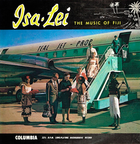
Isa-Lei: The Music of Fiji – various artists, Columbia/HMV NZ, 1961
How did this LP come about? It’s possible that a sharp operator working in HMV’s Wellington offices found inspiration in Frank Sinatra’s Come Fly With Me long player. Released locally by HMV in 1958, the cover of Frank’s album was notable for the synergy of TWA’s logo and livery with Sinatra’s own personal brand of swingin’ sophistication. Certainly, Isa-Lei’s aesthetic is far more genteel, but its commercial intent is no fluke. Within two years Columbia NZ had switched out the avuncular DC-6 cover shot for an updated image of TEAL’s faster and bigger Lockheed L-188 jet-prop. More seats meant more passengers; the air-travel boom was on.
Festival of the South Seas – various artists, 1961
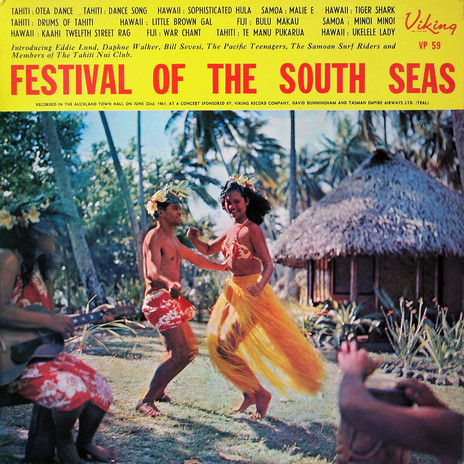
Festival of the South Seas – various artists, Viking, 1961
In the long run HMV NZ had other irons in the fire. As well as Sinatra, the early 1960s saw them releasing Cliff Richard, The Shadows and, just around the corner, a bunch of scruffs from Liverpool called The Beatles. They didn’t really need to hawk Pacific Island holiday tours on their LP covers (although they were happy to use their paper 45rpm bags for teen-focused Air New Zealand promotions). Independent music business operators scrabbling around for a dollar couldn’t be so choosy. Did Isa-Lei’s proto-marketing synergy give Murdoch Riley a few ideas?
Viking’s 1961 Festival of the South Seas album makes explicit the commercial arrangement between record label and airline company. “Sponsored by Viking Record Company, David Dunningham and Tasman Empire Airways Ltd,” states the cover. Plundering Viking’s trusty folder marked “Hawaii/Girls” (as featured in Sound and Vision: Album Design 2) for a suitably festive Polynesian village scene, the front image blends lush tropicality with an ethnographic vibe delivered in brisk, sans serif song listings, each with specific country of origin assigned.
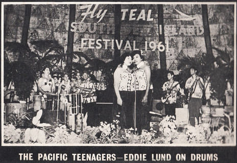
A series of pictures on the back of the album document the performers in action inside a chilly Auckland Town Hall, on 22 June 1961. Against a backdrop of impressive tapa cloths and lush foliage, TEAL’s branding and logo are clearly seen. The smart logo and the airline’s evocative marketing material was the work of Bill Haythornthwaite, a graphic designer (or commercial artist ,as they were then known) whose studio was just a few hundred yards away on Queen Street.
Briefed by the airline to create a logo design for TEAL that would “look like it belonged to the BOAC family – they had the speed-bird emblem and ours had to look like a little brother,” Haythornthwaite and his assistant George Moore “messed about” until they had a bird design. The board of TEAL turned their noses up at this first draft but, after some adaptation, what eventuated was the maroro, a flying fish, described in Maori myths leaping from the ocean to jump across the bows of the early navigator’s vessels.
Take Off – The Keil Isles, 1961
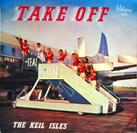
The Keil Isles' debut album for Viking, Take Off, issued in 1961
Haythornthwaite’s maroro features prominently on the back cover of The Keil Isles’ debut LP. Two of his flying fish clearly bookend a photo “courtesy of Tasman Empire Airways Ltd (TEAL)”, emphasising the business arrangement between Viking Records, David Dunningham – the Keil Isles’ promoter – and TEAL.
Unlike the Festival cover, there’s absolutely nothing ethnographic about the design of the Keil Isles LP. It’s pure rock’n’roll flash. The group, kitted out in the fanciest of duds, climb aboard a TEAL Lockheed Electra via airstairs you can imagine being used by the Jetsons. The LP title literally whooshes, with the custom italicised font – similar to Rockwell Condensed but having distinctive extended crossbars on the E and F – trailing a speed-of-sound slipstream. It’s a gloriously populuxe image evoking the optimism and innocence of the nascent youthquake.
The rock’n’roll explosion of the 1950s had promised freedom, and there was a post-war generation which fed hungrily on scenarios such as this. Whether it was a motorbike, car, Greyhound bus or – most potent of all – the aeroplane, the equation was simple: Mobility = Nobility. For young Kiwis, teetering on the edge of the world, some who believed themselves stranded in paradise, such images must have been especially resonant.
In Japan – Gray Bartlett, 1967
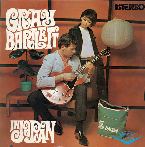
In Japan – Gray Bartlett, Impact, 1967
The cover of Gray Bartlett’s first album, The Guitars of Graeme Bartlett – as featured in “Sound and Vision: Album Design 2” – sort of blew my mind. It was new to me and – for an easy-listening LP on a small local label – I was surprised how good as it was. There was an ageless, bracing modernity to the design, proving that a low budget doesn’t necessarily equate to a low quality visual outcome.
Coming across this Gray Bartlett cover it was mind-blown-déjà-vu-all-over-again time. True, the approach here differs from the artless, candid-in-the-studio flavour of that first album, as this image is unashamedly contrived. But from the meager props of pot plant, paper lamp and lengths of 4x2 (daubed with black enamel in an approximation of a traditional Shoji screen), an essence of modish orientalism is somehow distilled.
At first, the image might seem faddish. In June 1967 the latest James Bond film You Only Live Twice – filmed largely in Tokyo – premiered in London, and it arrived in New Zealand cinemas in December. There was plenty of hype, especially when Sean Connery announced it would be his last outing as Bond.
Fair play then, if Gray and his manager, Benny Levin, saw an opportunity to cash-in on an interest in all things Japanese. But that wasn’t exactly the case. Bartlett and Levin had already cracked the Japanese charts with the instrumental hit ‘La Playa’. They had an agent on the ground and a record deal that would see Gray’s records released by the Victor Record Company of Japan.
That was a pretty big deal for a guitar-twangin’ Auckland Grammar School boy. Gray’s friend on the cover seemed to think so, draping herself across the back of the G-plan chair as she admires Bartlett-san’s nimble caress of his cherry-red Gibson. Or maybe she’s simply transfixed by his magnificent outfit?
Kitted out in a lightweight, powder-blue, unlined summer jacket matched with a salmon-pink, tab-collar shirt and shantung-silk gun-metal trousers, this is Gray Bartlett as 1960s top-draw male fashion plate. And just check out those shoes!
But of all the desirable items on show here – the cool girl, the vintage guitar, those wild winkle-pickers - it’s the Air New Zealand cabin bag that I really covet. Deeply recherché, it evokes a mythic past when flying still held the promise of civility and a frisson of globe-trotting glamour.
Our South Pacific: Air New Zealand – various artists
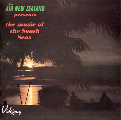
Air New Zealand presents the music of the South Seas, Viking, 1967
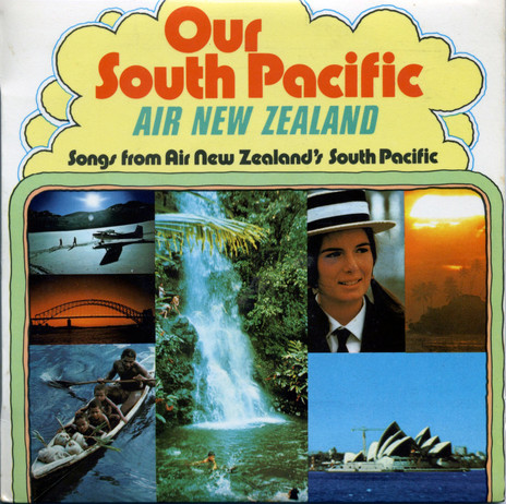
Our South Pacific, Air New Zealand, Songs from Air New Zealand's South Pacific, Viking, 1972
Gray Bartlett’s groovy cabin bag featured an Air New Zealand brand created when TEAL became government-owned in 1965 and renamed. (This was something of a transitional livery, with local designer Tom Elliot soon working in the background to phase out the maroro and install the iconic koru and unicase letterform logo that would be officially launched in 1973.)
Pressed into service by Air New Zealand’s marketing division in 1967, Viking Records put together an EP of tracks from its rich Polynesian and Pacific catalogue. Presumably the disc was available from the duty-free inventory of the DC-8s and DC-10s that were now flying the expanded Coral Route. The cover is a study in brown and orange – the soon-to-be ubiquitous colour combo of the dawning 1970s – and the liner notes are classic travel-agent boosterisms that tick off every cliché along the way. No room here for artist credits, however: this is music as commodity, a background sound-effect to accompany a tourism industry dream.
In 1972, shortly before Elliot’s new-era koru design was rolled out, Viking reissued the Air New Zealand EP with the same tracks but a revamped cover and title. The seductive, island sunset scene of the original was replaced by a smorgasbord of holiday brochure images, encased in a child-like wobbly hand-drawn frame. With its accompanying, chunky typeface called Pump, first created by Esselte Letraset in 1970, Our South Pacific exemplifies some of the style-traits that would come to define the gaudy, often brutish new decade.
--
Chris Mousdale is a native of Liverpool, England, living in New Zealand since 1990 where he works as an illustrator, designer and artist. His recent design work includes a series of covers for Blue Note Records in association with Music Matters Ltd. This article is the sixth of a series for AudioCulture.